|
|
|
|
|
| |
Design with Image component
We have now finished the cover page in frame 1 of the main timeline, so we can start to add image component to the template.
- Add a new layer to the main timeline, and skip the first frame to create a keyframe from the second frame. (Remember the first frame of the main timeline must not contain any visual components.)
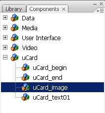
- From the uCard class in the components window, drag the uCard_image component and drop it to the keyframe on the stage.
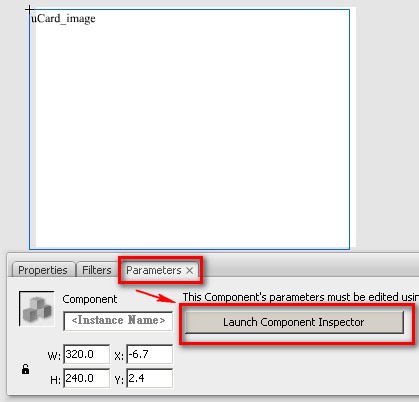
- While keeping the uCard_image selected, click the Parameters tab of the Properties window, and then click the [Launch Component Inspector] button to open the Component Inspector window.
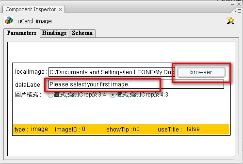
- The Component Inspector window's size might be smaller by default, you can enlarge it to show the whole by dragging on the bottom right corner of the boundary. In the Component Inspector window, click on the [Browse...] button of the Image field to select an image from your local hard drive. The image you select will become the default image of the field when users edit the MV with this template in YouVivid.com. In the Label field, input the text message that is used to prompt users about the image in MV editor.
Parameter description for image component:
Image: The default image that is shown when users edit this template. The user will replace this default image with his own in MV editor.
Label: The prompt message of the image field in MV editor.
- Press F8 Key to convert the uCard_image component on the stage to a Movie Clip and name it as [Symbol 1]. Please notice that it's imperative to convert the component on the stage to a Movie Clip so we can apply Flash's filters (graphic effect) on the Movie Clip object in later authoring. (Flash filters cannot be applied on components directly). The uCard_image component in the movie clip [Symbol 1], will become the container for the user to snap in the first image when the user edits the MV with this template.
- Now we want to create another container for the second image. First insert a new layer to the stage, and then repeat Step 1 - Step 5 above to add another uCard_image component to the new layer and convert it to a MovieClip with a name as [Symbol 2]. Please notice that you must add the second component by dragging the uCard_image from the components window and then dropping it to the stage again. DO NOT simply duplicate the component by copy/paste from the first component or movie clip on the stage unless you want the second container to host the same image as first.
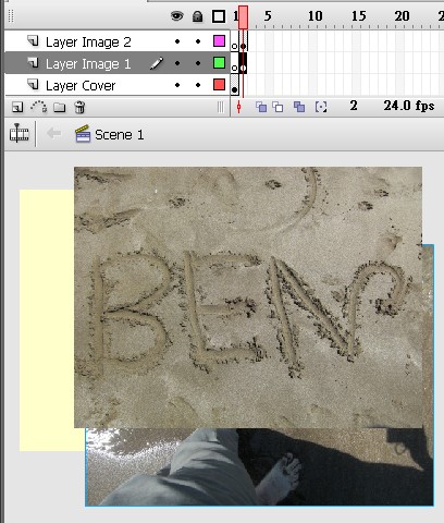
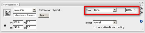
- By now we have 2 layers on the stage, each layer containing a movie clip as an image container. We can create the fade-in and fade-out transition effect between these 2 movie clips: In layer1, apply motion tween on the movie clip [Symbol 1] by adjusting its alpha value from 100% to 0% to create a fade-out effect for the first image.
And in the layer 2, at the same time frames of Symbol 1 fade-out transition, we apply a motion tween on the movie clip [Symbol 2] by adjusting its alpha value from 0% to 100% to create the fade-in effect for the second image.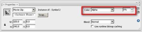
We can also insert some leading frames in layer1 to show the first image before transition, and insert some tailing frames in layer 2 to show the second image after transition. Remember to keep frame 1 in both layers blank, as the image component cannot be used in the first frame.
_  

Now we've done the image part, let's move on to design text in the next paragraph.
Next: Design with text component
|
|
|
|
|
|
|


