|
|
|
|
|
| |
Design with Text component
We finished the design of the image in the previous paragraph, and now we’ll move on to the designing the text in this section.
Please follow the steps:
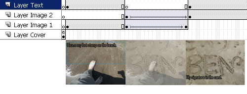
- We have already created 2 image containers for the user to snap in his images to this template, now we will add 2 text fields so that user can edit image descriptions. Let's first make a new layer on the main timeline for inserting the text components. Skip the first frame and create the keyframe from the second frame. (Remember the first frame of the main timeline must not contain any visual components.)
- Drag the uCard_text01 component from the uCard class in the components window and drop it in the keyframe of the new layer we just created.
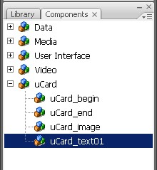
- Launch the Component Inspector window to configure the parameters for the uCard_text component. While keeping uCard_text on the stage selected, click the Parameters tab of the Properties window, and then click the [Launch Component Inspector] button to open the Component Inspector window below.
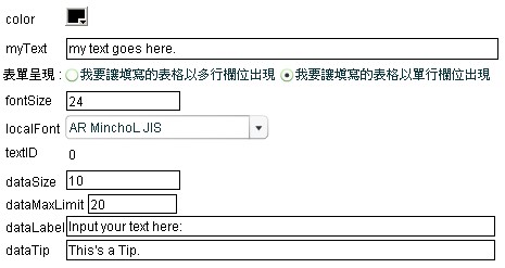
Here are the parameter settings for the uCard_text component:
Text: Default text message of the text field. User can edit this text message in MV editor.
FontColor: Font color of the text.
FontSize: Font size of the text. The default font size is 24 point which is suitable for viewing from a mobile device.
FontType: Font type of the text. Later when we export the MV template, the font type file will be packed into the output file.
FontMaxLength: The maximum character length that allows the user to enter in this text field.
Label: The prompt message for the text field in the MV editor.
- After setting the parameters in Component Inspector, you can adjust the position and display area of the text field by modifying the x, y, width, and height properties of the text components.
- Convert the text component to movie clip so we can apply Flash filters on it in later authoring. Never skip this step.
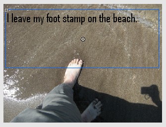
- Since the text is to be shown above the image as image description, we need the text to stand out from the background image. So we will add some graphic effects to the text by applying Flash filters on the text movie clips as below:
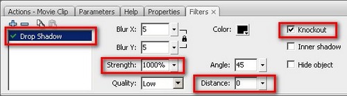
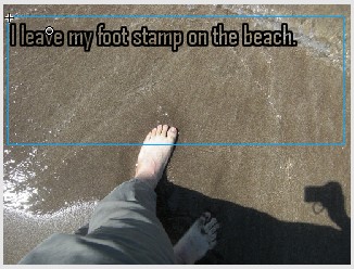
This is the result of applying the Drop Shadow
filter:
- We have created a text field for the first image description. Now we are going to create a second text field for the second image. Again, let's repeat step 2-6 to create the second text movie clip in the same layer of the stage. After that, we will insert frames and keyframes in this layer and rearrange the 2 text movie clips so that first text will show with the first image before transition and second text show together with second image after transition.
The design of the MV template's text and image components is now complete, and we will move on to the control component in next paragraph.
Next: Design with Control component
|
|
|
|
|
|
|


